How to Create Circular Progress Bar in SwiftUI
Jul 18, 2024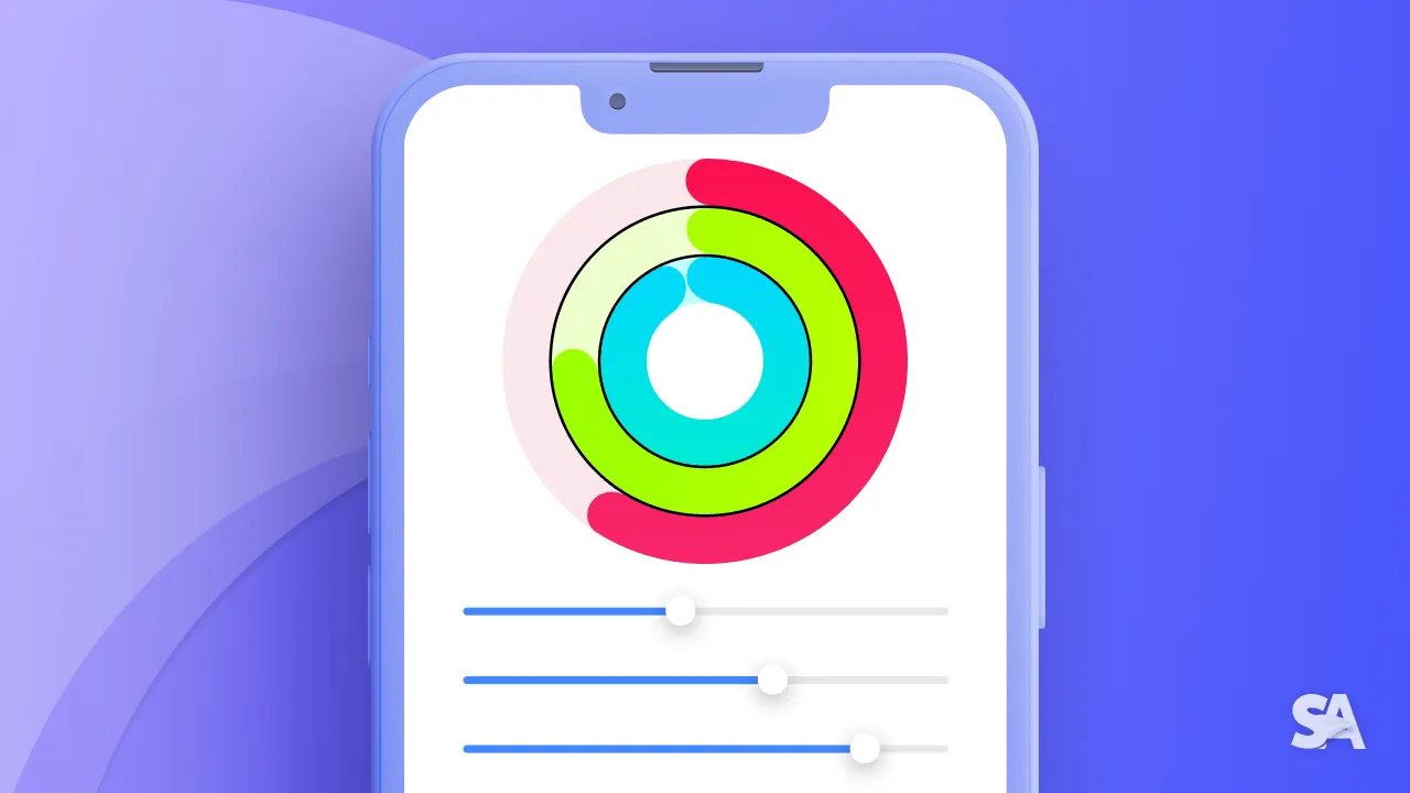
When you think of implementing a circular progress bar, the first thought would be to use ProgressView. But in iOS, if you apply a circular style to the ProgressView it can only show a spinner and not a circular track which gradually fills as the task moves to its completion.
This tutorial will guide you through creating a circular progress bar using SwiftUI. We will build a manual version of activity ring that you see on a Apple Watch where three rings summarize the progress of each of the activities i.e. Move, Exercise and Stand.
This is how our circular progress activity bar would look like.

Looks interesting? Let's start building.
Basic Idea
The idea is to make use of two circular outlines where the top one represents progress and moves as the progress value changes, while the one at the bottom remains static and acts as the background. When the user moves the slider to modify the activity, it gives the effect as if the circular track is being filled or emptied.
Step-1: Create circular rings
We will use SwiftUI Circle to create a circular shape and apply the stroke modifier with a specified width to form a ring. Since the rings look similar in terms of appearance except the color and size, we'll pass the color as a parameter and give different size by using frame modifier.
struct CircularProgressBar: View {
    var body: some View {
        VStack(spacing: 30) {
            ZStack {
                ActivityProgressView(color: Color(red: 250 / 255, green: 17 / 255, blue: 79 / 255))
                    .frame(width: 300, height: 300)

                ActivityProgressView(color: Color(red: 166 / 255, green: 255 / 255, blue: 0 / 255))
                    .frame(width: 200, height: 200)

                ActivityProgressView(color: Color(red: 0 / 255, green: 255 / 255, blue: 246 / 255))
                    .frame(width: 100, height: 100)
            }
        }
    }
}

struct ActivityProgressView: View {
    let color: Color

    var body: some View {
        ZStack{
            Circle()
                .stroke(lineWidth: 40)
                .opacity(0.1)
                .foregroundStyle(color)

            Circle()
                .stroke(style: StrokeStyle(lineWidth: 40, lineCap: .round))
                .foregroundStyle(color)
        }
    }
}
Result:

In the ActivityProgressView,
- We have first created two circular rings placed within a ZStack, allowing one to be positioned over the other.
- We have used the same foreground color for both the rings but to make the bottom ring appear as a background, some opacity is given additionally. If you comment the second Circle view, you would be able to see the ring at the bottom.

- To make the endpoints of progress ring rounded,
lineCapparameter value is set to.round.
Step-2: Create a Slider to adjust the progress
For tracking the current progress of each of the activities, we will first create three @State variables for move, exercise and stand respectively in the parent view.
@State private var moveProgress: CGFloat = 0.0
@State private var exerciseProgress: CGFloat = 0.0
@State private var standProgress: CGFloat = 0.0
The initial value of 0.0 denotes the activity has not yet started and 1.0 represents its completion.
Since the top ring out of the two displays the amount of progress, the stroke length needs to be trimmed as per the current value of each activity.
Hence, we will also have to pass each progress value as a parameter and trim the top circle as per the progress value.
// Update in CircularProgressBar
ZStack {
    ActivityProgressView(color: Color(red: 250 / 255, green: 17 / 255, blue: 79 / 255), progress: moveProgress)
        .frame(width: 300, height: 300)

    ActivityProgressView(color: Color(red: 166 / 255, green: 255 / 255, blue: 0 / 255), progress: exerciseProgress)
        .frame(width: 200, height: 200)

    ActivityProgressView(color: Color(red: 0 / 255, green: 255 / 255, blue: 246 / 255), progress: standProgress)
        .frame(width: 100, height: 100)
}

struct ActivityProgressView: View {
    let color: Color
    let progress: CGFloat

    var body: some View {
        ZStack{
            Circle()
                .stroke(lineWidth: 40)
                .opacity(0.1)
                .foregroundStyle(color)

            Circle()
                .trim(from: 0.0, to: progress)
                .stroke(style: StrokeStyle(lineWidth: 40, lineCap: .round))
                .foregroundStyle(color)
        }
    }
}
If you change the value of moveProgress to 0.8, exerciseProgress to 0.4 and standProgress to 0.2 say, then this is how the progress bar would look like:

Now, let's create a slider to let user adjust the value of each activity's progress. For that we'll create SliderView and pass the progress value as a @Binding allowing SliderView to update the respective progress state variable.
// Add the VStack to CircularProgressBar
VStack(spacing: 10) {
    SliderView(progress: $moveProgress, title: "Move Progress")
    SliderView(progress: $exerciseProgress, title: "Exercise Progress")
    SliderView(progress: $standProgress, title: "Stand Progress")
}
.padding()

struct SliderView: View {
    @Binding var progress: CGFloat
    let progress: CGFloat

    var body: some View {
        VStack {
            Text(title)
                .frame(maxWidth: .infinity, alignment: .leading)
            Slider(value: $progress, in: 0...1.0, minimumValueLabel: Text("0"), maximumValueLabel: Text("100%")) {}
        }
    }
}
Result:

Step-3: Adjust the starting point
If you notice, the progress bar starts from right instead of top. So, to make it start from the top, we can rotate the progress ring and change it's angle to 270 degrees by using the rotationEffect modifier.
.rotationEffect(Angle(degrees: 270.0))Result:

Step-6: Create Button to reset the progress value
If you also want to let user reset all the activity rings, you can create a button to do so, although this last step is optional.
To achieve this, you simply have to set all the activity progress values to 0.0 when the user hits the "Reset all" button.
Additionally, we will add an animation to the top ring to enhance the visual appeal of the reset action.
// Add the Button to CircularProgressBar
Button("Reset all"){
    moveProgress = 0.0
    exerciseProgress = 0.0
    standProgress = 0.0
}

// Add the modifier to top circle in ActivityProgressView
.animation(.linear, value: progress)
}
Result:

You can add any other type of animation as well.
Get the complete code here.
Congratulations if you have come this far. You deserve to celebrate this moment. Today you learned how to create a Circular Progress Bar in SwiftUI and there is no deny to the fact that it's a bit complex.
In case you are looking to implement a basic progress bar in your SwiftUI project you can refer to ProgressView in SwiftUI. Also, do checkout the article How to show progress on a task using ProgressView in SwiftUI.
Signup now to get notified about our
FREE iOS Workshops!
